Granel
The app mapping bulk stores in Barcelona
UX/UI | App Design | Interface Service
Toolkit: FigmaJam, Figma, tl;dv, Google Form
Design Challenge
How might we design a digital solution that makes it easier for people in Barcelona to discover, explore, and stay informed about local bulk stores and their offerings, in order to support more sustainable and conscious shopping habits?
My Role
Competitive benchmark, UX Research, Ideation, Mid- & High-fidelity Wireframes, Prototype, Usability tests & Iterations


Problem Overview
Current online resources often fail to provide comprehensive and up-to-date information about bulk stores in Barcelona, making it difficult for individuals to discover their location or product offerings and incorporate them into their shopping routines.
This lack of information limits access to alternatives to supermarkets for consumers seeking them out.
Design Process
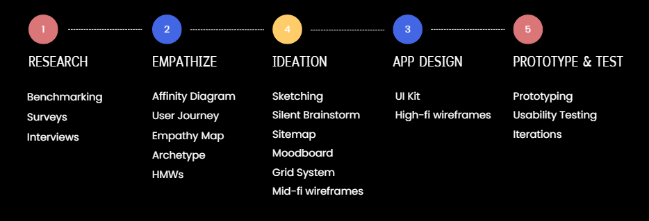
Research Method
During the research phase, I conducted a competitive benchmark, gathered quantitative insights through surveys and carried out 5 in-depth interviews to collect qualitative data, which I later analyzed using an affinity map to identify key patterns and user needs

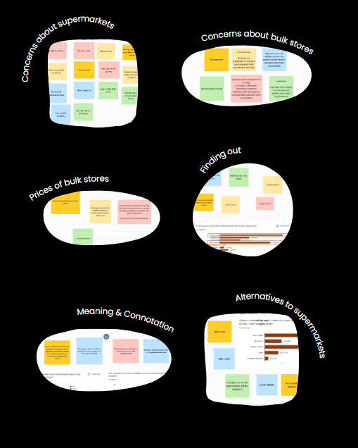
Affinity Map
I created an affinity map to organize and synthesize the research findings, making it easier to identify common themes and user insights.
5 key insights stood out:
Concerns about bulk stores vs. supermarkets
Meaning & connotation around bulk stores
Finding out bulk stores’ location
Time & proximity while shopping for food
Common alternatives to supermarket chains
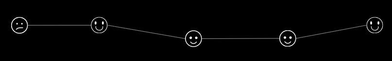
Empathy Map
To further humanize the data and step into the users’ mindset, I created an empathy map that captured what users say, think, feel, and do—revealing deeper emotional drivers and potential pain points.

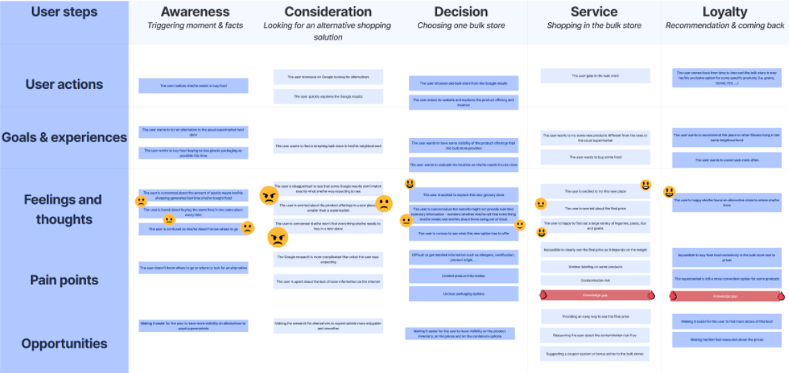
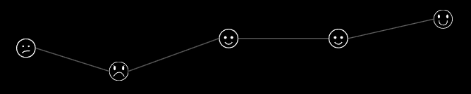
User Journey
To visualize the user experience and identify pain points and opportunities, I mapped both the current and ideal (future) user journeys—highlighting the gaps the design aimed to bridge.
Scenario: Looking for a sustainable and packaging-free alternative to the usual supermarket

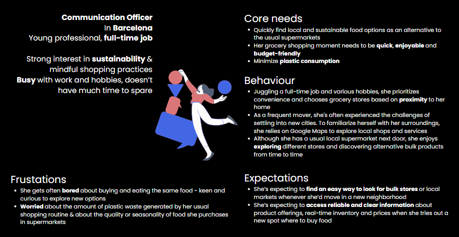
Archetype
After mapping the noise, I found the pattern—and that pattern became the archetype.
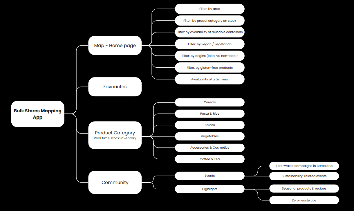
Sitemap
A sitemap was created to establish a clear and intuitive information architecture, ensuring a seamless user experience.
Ideation
The ideation process began with a silent brainstorming session in a small team of three—allowing diverse ideas to surface without bias—before evolving into rapid sketching and, ultimately, mid-fidelity wireframes.
Design System
I developed a cohesive design system including a UI kit, typography, iconography, color palette, and a reusable component library to ensure visual consistency and design scalability.


High-fidelity wireframes
With all the key elements in mind — from structure to user flows and visual direction — I was finally ready to bring everything together in high-fidelity wireframes. This step helped me shape the final look and feel of the interface.
User Flow
I designed and defined a user flow to test key interactions and ensure a seamless experience across the main touchpoints of the product.
Scenario: The user wants to explore the bulk stores around her/him that have accessories without packaging on stock today

Usability Testing & Final Iterations
To validate the design, I conducted moderated usability tests with 4 participants. I measured task completion rate, error count, and time on task to identify key usability issues.
Based on the insights, I iterated on several UI elements—improving icon placement, text legibility, map markers, and spacing in key sections. These refinements enhanced clarity and user experience significantly.

See next project
